This blog has moved into new territory and can now be found at:
'The Thirsty Creative'
http://thirstycreative.wordpress.com/
Wednesday, 9 September 2009
Monday, 10 August 2009
Bloomsbury Inspiration
 Having lived in Sussex for nearly 8 years I'm rather ashamed to admit that, until last week I had never made it into Charleston House. I've enjoyed coffee in the tea room, Alain De Botton's philosophical ruminations at the Charleston Festival and occasionally wandering through the beautiful walled garden. However last week, I was introduced to the charms of Charleston House, East Sussex...finally and without disappointment.
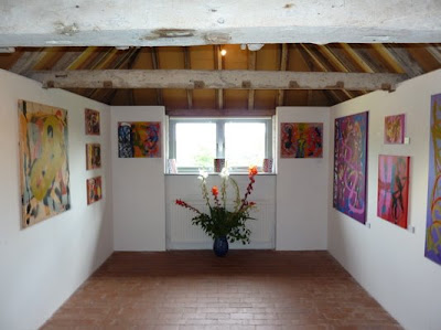
 Nestled between Eastbourne and Lewes, Charleston House tours can be booked on Wednesdays and Saturday's with a guide and it was certainly a very worthwhile £7.50. You can't book in advance so be prepared to wait a while, (an hour and 15 minutes in my case). Prior to the tour commencing I took advantage of appreciating the vibrant canvases of Maurice Cockrill RA and a meander through the shop (not your average tourist shop, there's some lovely pieces of textiles, object d'art, Bloomsbury books etc but do expect to pay more for the privilege).
The August sunshine brought a number of visitors on the day I visited but Charleston House maintained it's unique atmosphere that seemed to radiate throughout: an enigmatic 'Englishness'. Whilst waiting I also enjoyed a good sized, tasty, salad for £5 although at busy times (and 25 minutes later), a larger kitchen and more staff would be an advantage for what is I expect the busiest time of the year.
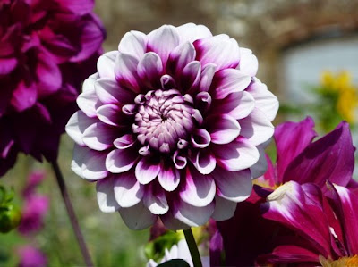
 Janet was my group's guide for the 60 minute tour and her knowledge and enthusiasm were impressive. I felt a genuine warmth for the place from the staff at Charleston. The curator has achieved a wonderful show of what life was like at Charleston for the Bloomsbury set and their inspiration - standing in the sitting room I could smell the tobacco and hear the passionate conversations of some of this countries finest artists, poets and writers including Virginia Woolf, Duncan Grant, Vanessa Bell, Clive Bell, David Garnett and Maynard Keynes.
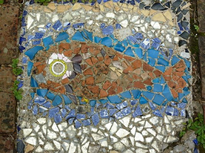
Inspired by Vanessa Bell's desire to create a home for her two boys and this amazing house where every surface has been personalised with paintings, textiles, mosaics, ceramics, like many visitors I expect, I set to work on bringing at little bit of Charleston into my home. After my visit I really felt in the age of cheap fast interior design, perfection on a budget, that we're missing that homely feel, so prevalent at Charleston House. Living on a budget is wonderful for getting my creative juices flowing and the boys are always enthusiastic about 'personalising' their space....with permission this time.
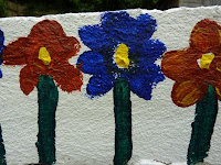
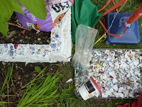
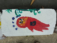
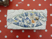 Enlisting the help of our 4 and 7 year old neighbours, we set to work on transforming some garden hard core and our old kitch ceramics into homegrown object d'art. Here are the results: not perfect, not to everyone's style or taste, not ready for the pages of 'Elle Decoration' but everytime I look out onto our painted bricks and shattered ceramics it isn't just the blast of colour they have brought to the garden I enjoy. I also remember a fantastic creative afternoon with the kids - and you can't buy that in B&Q.
Wednesday, 5 August 2009
Dodge and Burn Baby
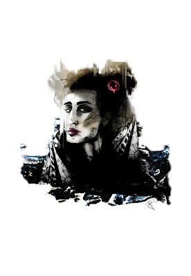 As a fairly pedantic artist I'm on a mission to create a series of images, created in just a few hours every week. Last week saw 'Emerge' this week's offering is 'After Erin' (click the image to see a larger version).
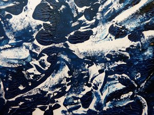
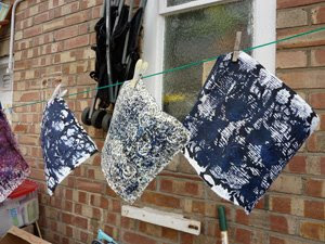 A lazy Sunday afternoon saw me monoprinting in the August sunshine with a variety of materials including random papers, oil paints, acrylics, Indian ink and a lot of water. The results were pretty nice textures perfect for 'Photoshopping'. I'm addicted to finding a variety of textures, patterns, photos etc for use in my digital collages. No matter how simple the image, the subtle addition of a found texture can add a definite depth.
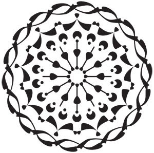
I wanted an almost 'chiaroscuro' effect but with loads of white space to create something that was still very clean. Taking four elements, a pen and ink drawing from my sketchbook, a photo, a pattern (in this case a vector pattern I drew in Illustrator) and a monoprint I set to work last night conducting another Photoshop experiment. Armed with my Wacom Intuit A5 Tablet, the kids plonked in front of Star Wars, I set to work.
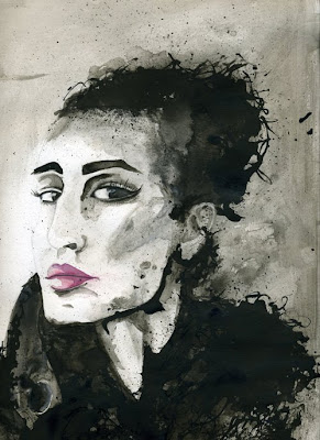
 I'll be teaching Photoshop this Autumn at Sussex Downs college so I'm also focusing on various tools each week. The past few weeks have seen me experimenting with Photoshop Channels but as a painter I wanted to use my tablet for well um... a more painterly purpose. Intuitively this has led me to the smudge, blur, dodge and burn tools.
Working in a structured manner designing websites, over the years has made me a little stale and reluctant to leave my comfort zone. Like many Photoshop users I'm a big fan of blending modes in the layers palette to create the depth of effect I've wanted and also with looming deadlines, they always offered the quickest results. However I've found the dodge, burn, blur and smudge tools have been an excellent way to create subtlety in specific areas (this week, especially the around the eyes) and have whet my appetite to consider creating an entire painting in Photoshop...we'll see...
 Anyway, if you are used to working with paint, chalks, pastels etc these Photoshop tools offer the flexibility that you would have with traditional materials ie using your fingers to smudge or blend a line, and more. Dodge and Burn will lighten or darken an area without altering its underlying marks or composition. The sharpen tool, whilst useful can sometimes leave areas a little pixelated.
Moving beyond the familiar and working in a new way has been quite liberating and set my mind alive with new ideas. Looking for new elements to include in images has suddenly made the everyday pretty interesting. As always with Photoshop, experimentation is the key and corny as it sounds, my best discoveries have been my mistakes.
Labels:
Art,
burn tool,
digital collage,
dodge tool,
graphics,
Illustrator,
monoprinting,
pen and ink,
Photoshop CS3,
sketchbook
Wednesday, 29 July 2009
Excellance in Beauty
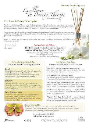
A printed newsletter commissioned by my lovely friend (and super fantastic therapist!) Lorraine. A font of beauty knowledge, Lorraine's advice, recommendations and obvious passion is indispensable to all self respecting females (and males) out there. Click the image to read some super top tips for a bikini confident body this summer.
Produced in InDesign CS3.
Labels:
design for print,
Graphic Design,
indesign,
newsletter
Tuesday, 28 July 2009
Sunday, 5 July 2009
Beaded Lady
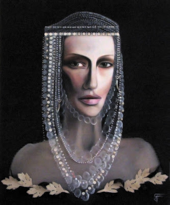
Following on from a previous post, I decided to paint this in the end. Indulged my pedantic side and stuck on every bead and button by hand...
Mixed media, (acrylic and oil on canvas, beads, buttons and suede)
Monday, 29 June 2009
Art & Wine Workshop
 Ah Art and wine, Napa does it so well and who hasn't enjoyed that moment of divine inspiration after a Chablis or two? So EVT decided it was time the UK explored the vineyards artistically speaking except I decided to go as a punter and fellow artist on the first Sussex Art & Wine Workshop to Carr Taylor Vineyards.
 After meeting with the most delightful group of ladies you could hope to on the tour, Dave our guide from Carr Taylor gallantly showed us the vines, winery and shared a joke or two whilst tasting 6 wines from the estate (if you're ever in the vicinity, ask about the Pinot More...)
 After a yummy ploughman's lunch with a glass of sparkly surrounded by the vines we spent an inspirational afternoon with artist Katie Sollohub. An amazing colourist, Katie's laid back approach to making art was incredibly playful (and I'm someone who can be somewhat tight with work), but by the end of the day we were tearing, dabbing, sticking, and spattering in response to the tastes of the wine and amazing scenery in the vineyard. We drew inspiration from Kandinsky, Hodgkin, Sisley amongst others for their mark making and colour interpretations.
 Using three different materials we warmed up making a large mark, long line and small mark, each in a different material. We worked like this for a while and then ripped it up! Using the pieces as starting point we stuck a couple of these pieces (some from other peoples work) onto a clean sheet and started to work more from the landscape this time. The results were beautiful - fresh, dynamic and colourful. I'm terrified of colour usually but I came away with a new sense of colour confidence.


 Coming home, I tried the exercise with my children 5 & 7 and was astounded by the results especially by my 5 year old. Laying down marks in a variety of materials and colour and allowing yourself to just see what happens is incredibly liberating. Working in design and in the constraints of the digital environment I really enjoyed this exercise.
The vines have flower set now, the precursor to bud-set - that's when the grapes start appearing to you and me. In 2 to 3 months they will be ready for picking and in quite a few months after, ready for drinking. I plan to repeat this exercise drinking the wine that was made by the very grapes and vineyard that provoked my creative juices to start flowing once more.
PS Thanks to Ben for being Gofer for the day and the additional glass of wine or 2 :)
Wednesday, 10 June 2009
PS: Crossing the Channel
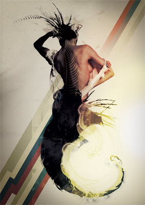
For some reason, in all my years of using Photoshop, I've never truly explored and exploited the power of channels and masks within Photoshop - a mental block of some sort I guess. However I've conquered this fear and quite frankly I'm hooked. From isolating complex images (in this case bones, feathers and hair) to using a soft brush to subtly mask out areas resulting in more naturally blended elements, this work in progress has enlightened me to yet another powerful Photoshop feature.
Subscribe to:
Comments (Atom)

